Haluski (cabbage and noodle dish) with Matka's branding
Branding / Typography / Logo
The Challenge: Create a company and its branding from the ground up.
The Solution: Matka’s, a vegan eatery with a primary focus on traditional polish
cuisine with a vegan twist that also serves as a gift to my mother.
cuisine with a vegan twist that also serves as a gift to my mother.
Audience
A focus on those who identify as vegan with a particular focus on Polish vegans
Located in the Buffalo/Western New York area, there is a lack of restaurants that are vegan and/or vegan friendly
Matka’s seeks to deliver new and traditional foods as vegan for those who cannot have the meals in traditional ways
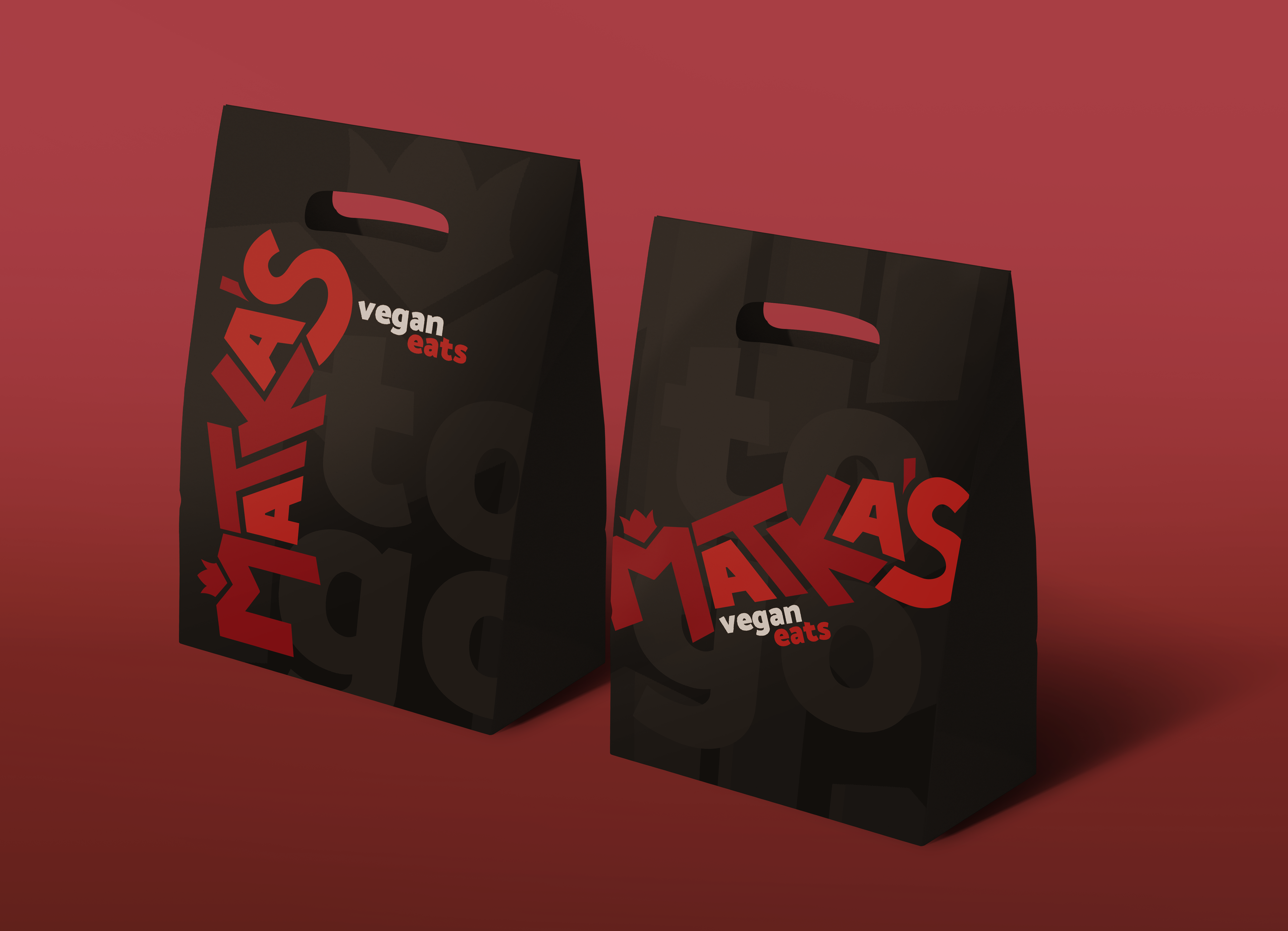
Two versions of Matka's custom take-out bags
The Concept
Elements of punk posters and punk culture
Inspiration from Polish design, particularly Polish Posters
Variations of angles, sizes and nesting helps the name give itself a personality and a pop/funkiness to the logotype.
Matka’s is a fun-loving, creative brand, the use of variating angles and lengths give the initial viewing of the type that fun feeling
Black and white versions of Matka's final logo
Why the red?
Red is not only the main color associated with
Poland it is also my Mother’s favorite color
Poland it is also my Mother’s favorite color
Red #9A0B15, is the same red that
my mother chose to paint her kitchen
Red also represents and portrays passion,
much of which my mother has
much of which my mother has
Color callouts for both reds used in the logo
Final Marks
Primary Mark
Matka's primary mark in sizes going to its smallest
Alternate Mark
Matka's alternate mark in sizes going to its smallest
Simplified Mark
Matka's simplified mark in sizes going to its smallest
Research, Sketches, Studies
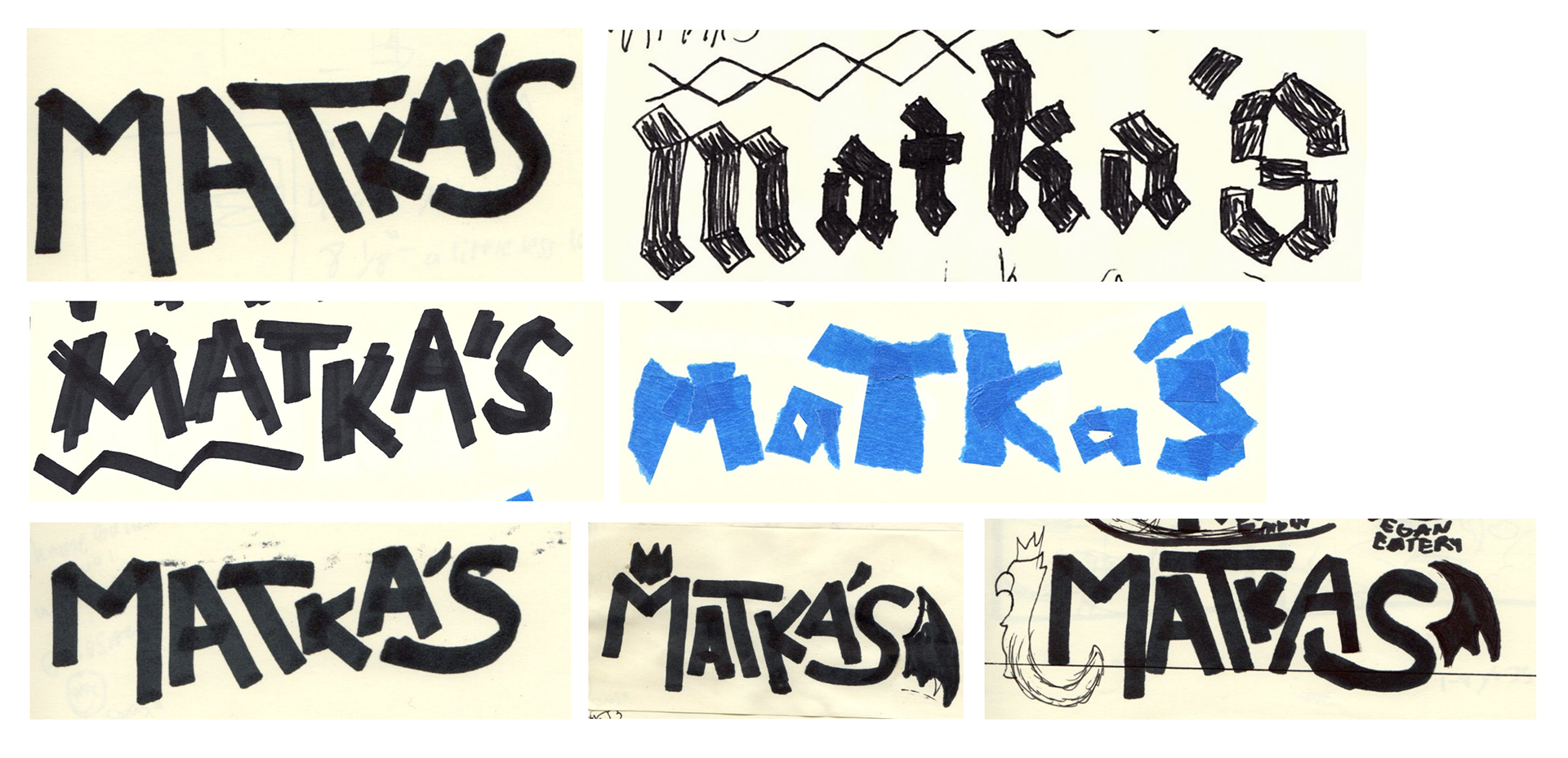
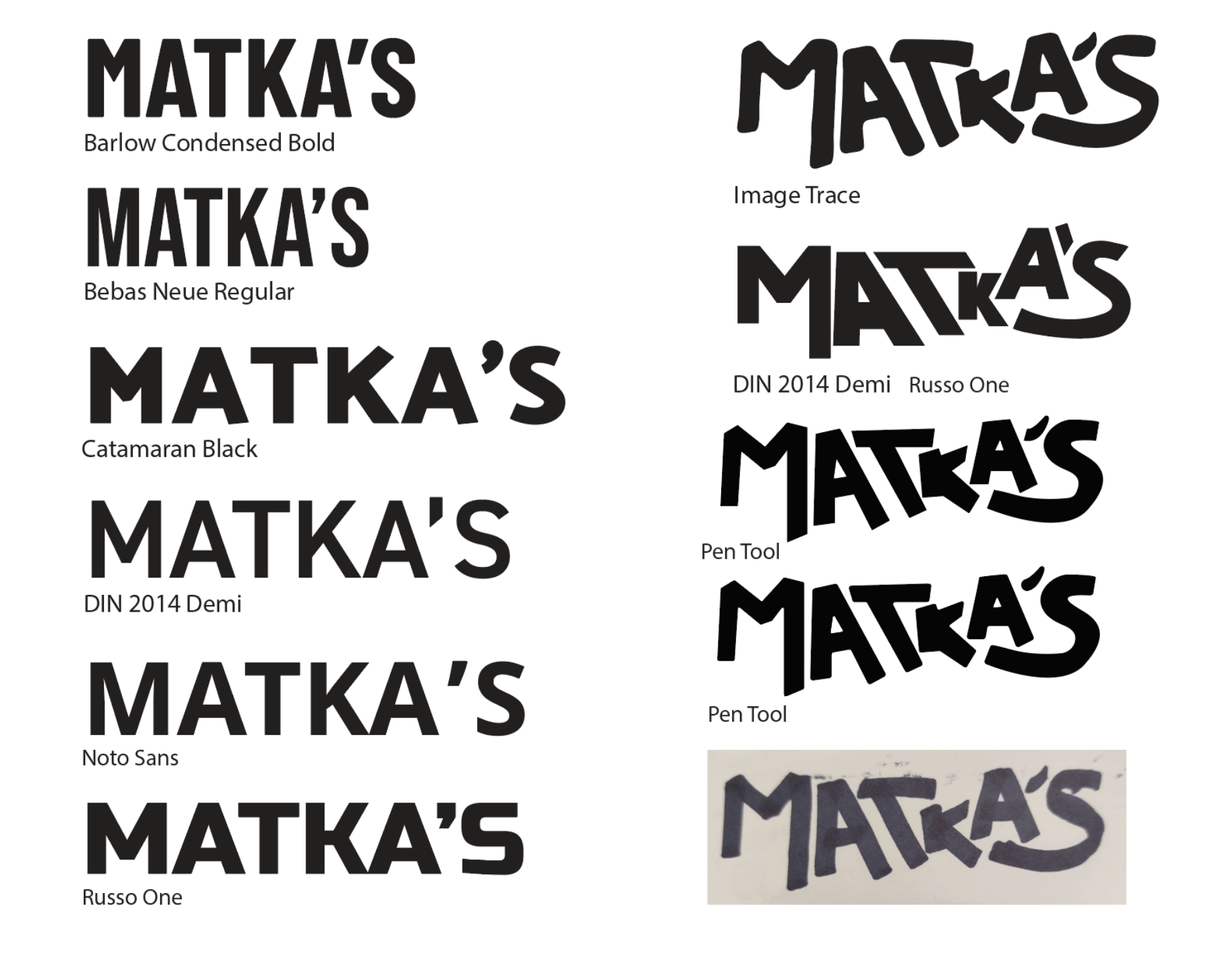
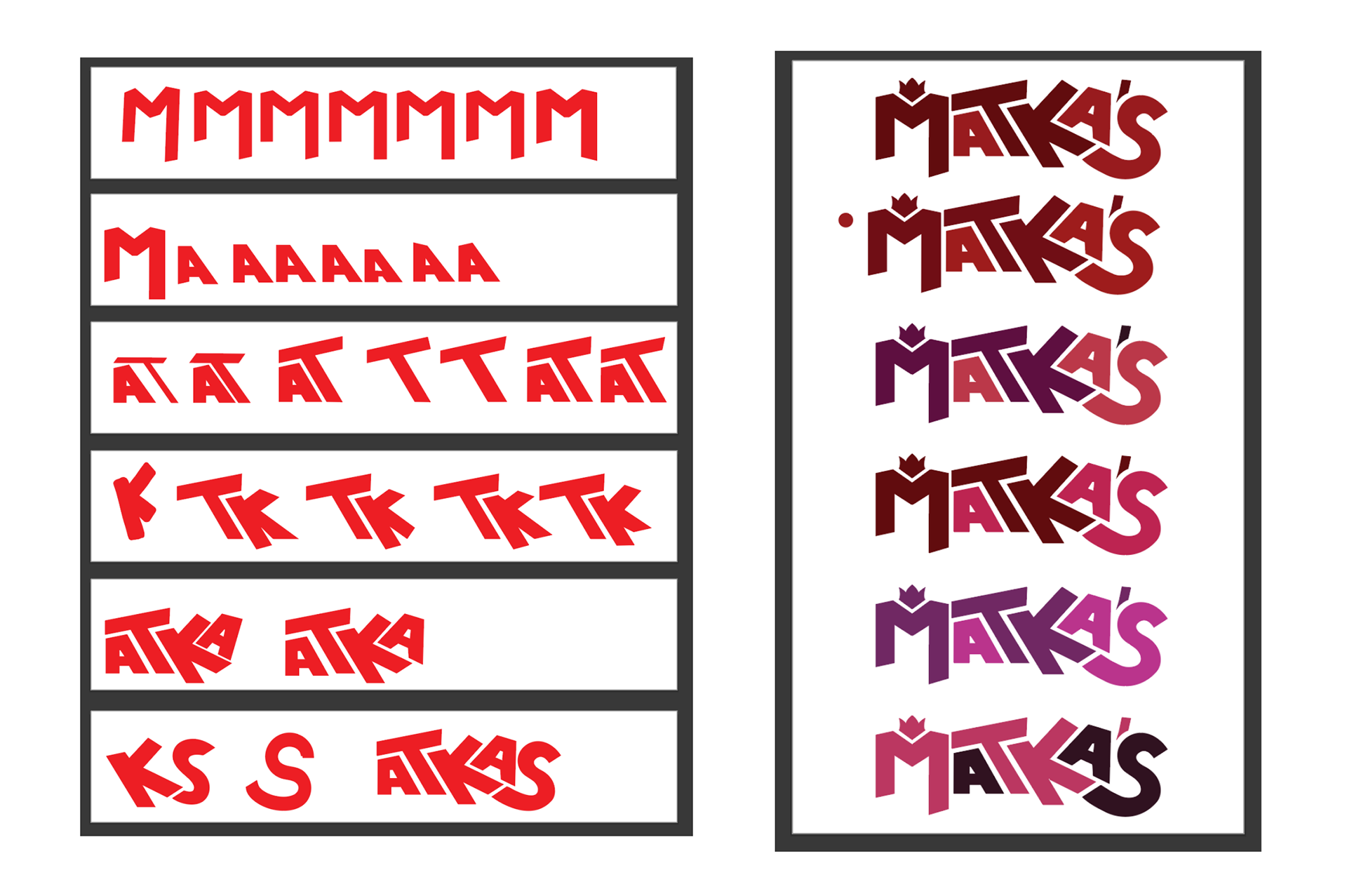
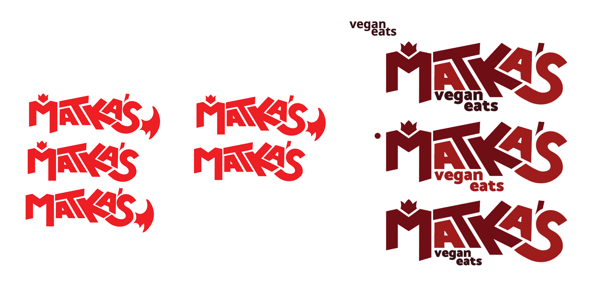
Top to Bottom: research, traditional sketches, type study, letterform creation, color choice, alterations
Store and Food Mockups
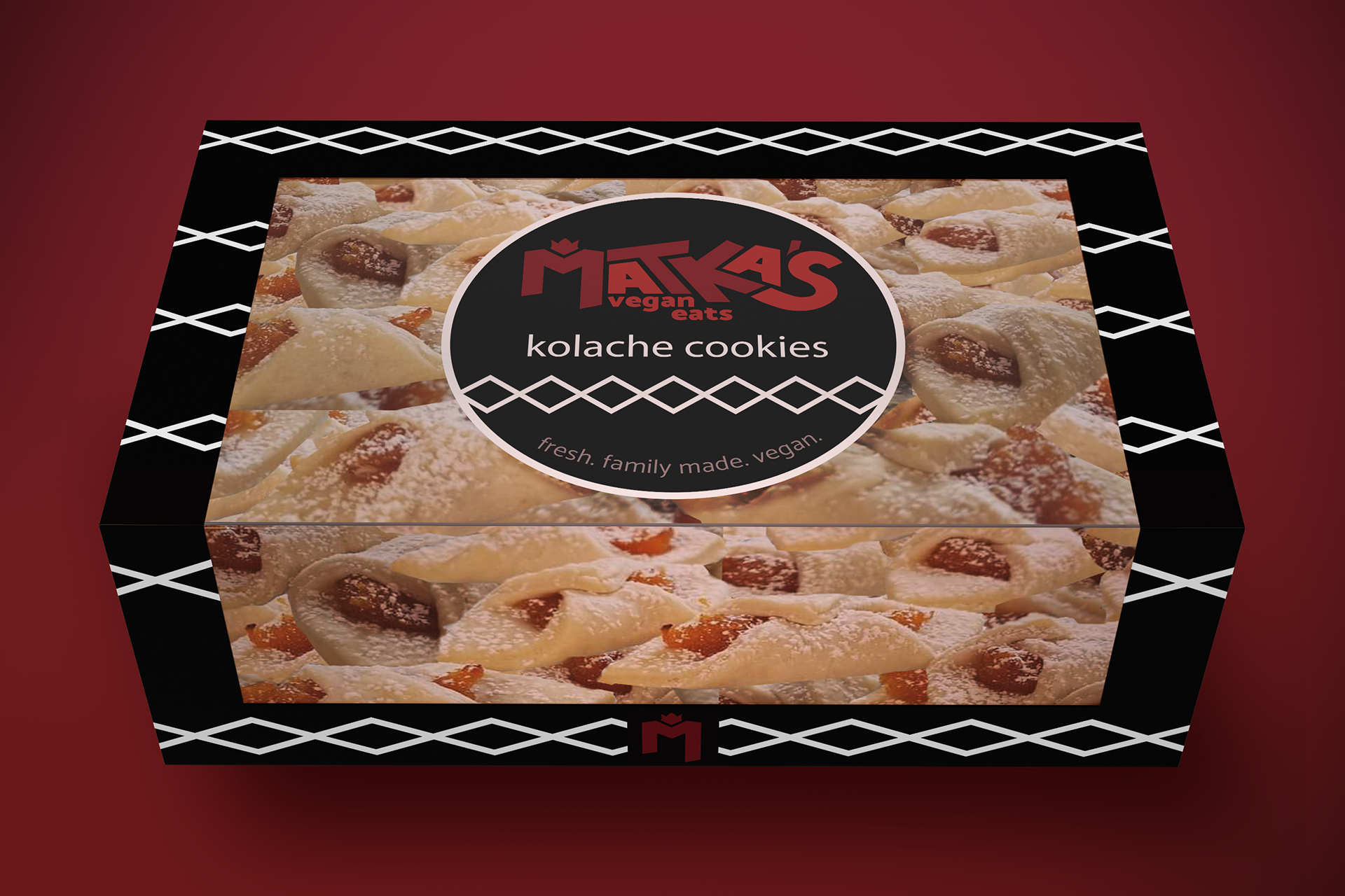
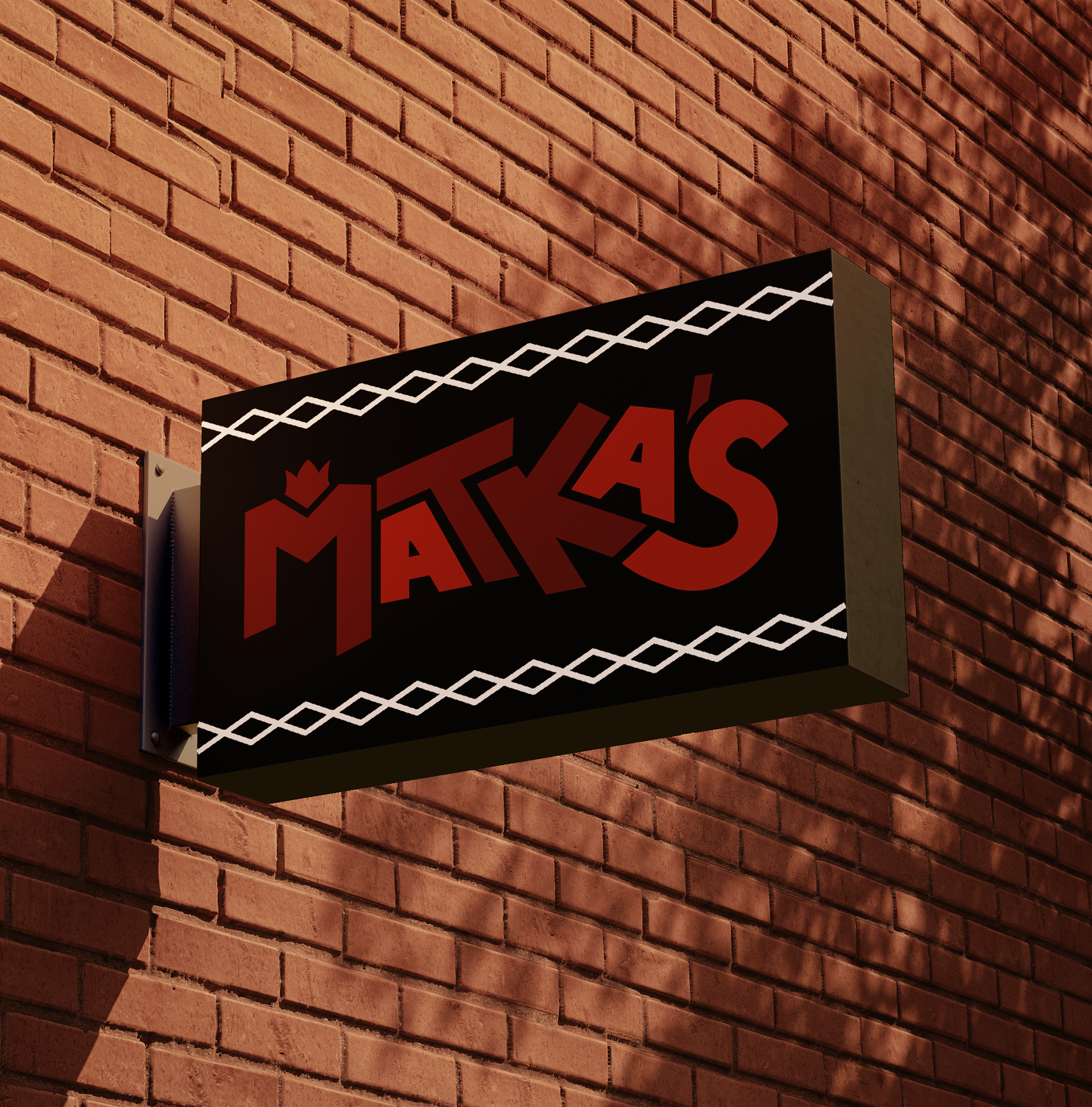
Left to Right: Kolache cookie box, Matka's street sign
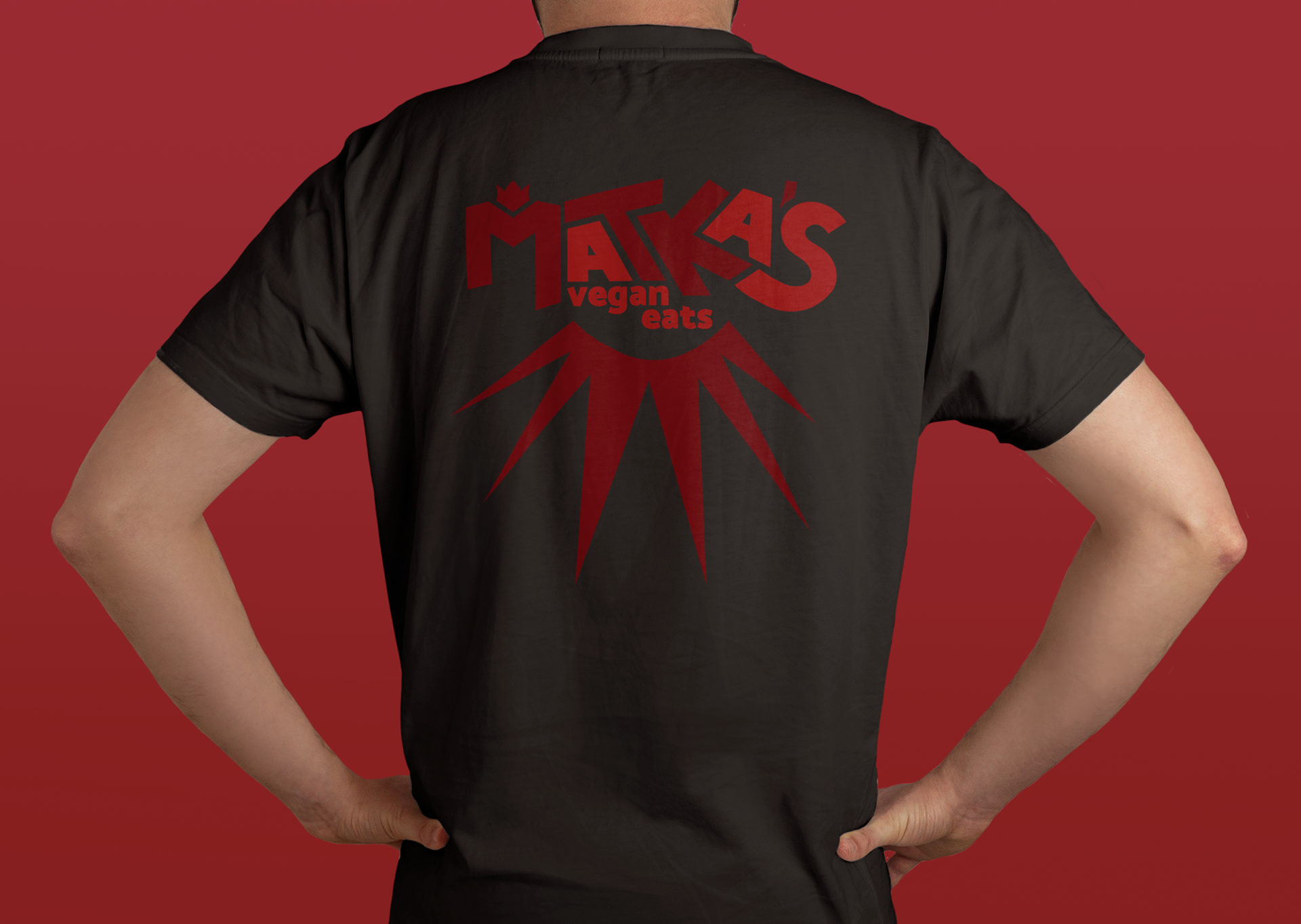
Bottom: Matka's back-print shirt and to-go bags
Three frozen "cheese" pierogis Matka's packages
Fin.
